"To accommodate the vast array of books representing many centuries of our culture in a multi-functional public building designed to be an exciting, adventurous place to visit." Building a library is a classic example of an assignment that does NOT primarily require making a composition of the exterior of a building, a collection of façades, but rather mainly requires designing the interior world of the building.
'The building and the interior are intricately connected'.
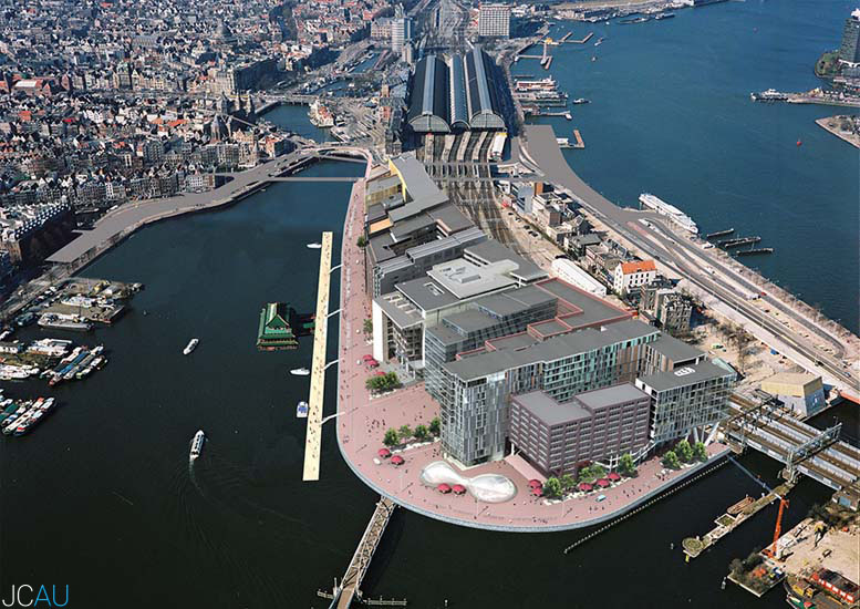
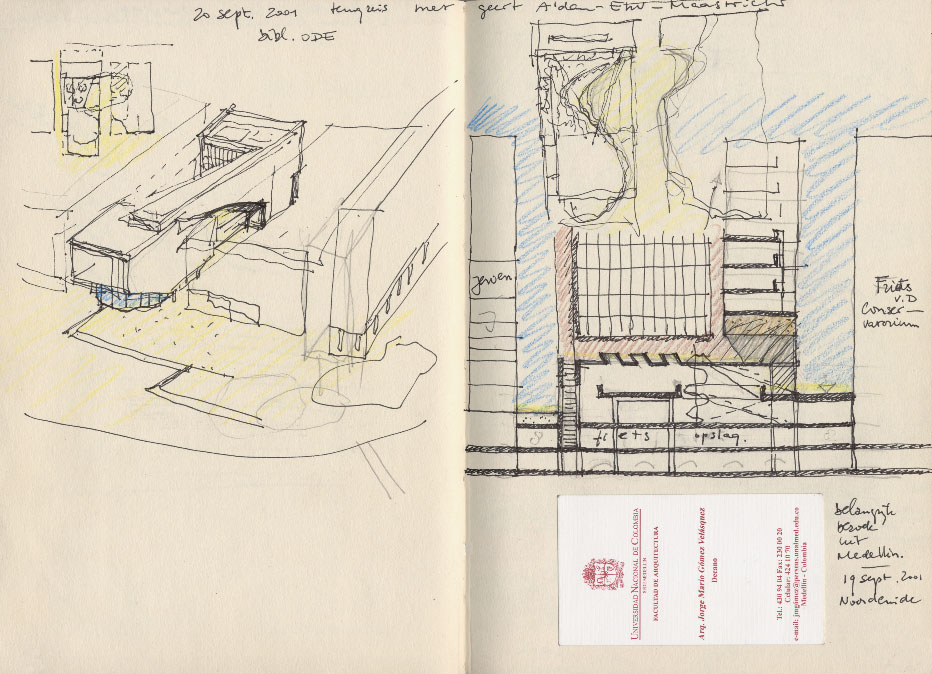
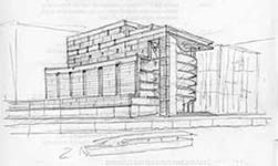
For this reason, Jo Coenen not only wanted to design the building, but also its interior. The assignment was to build a stacked-up, envelope-shaped building of 28.500 square meters, in compliance with existing urban development plans, with a volume consisting of a height of 40 m, a width of 40 m and a length of 120 m, approximately.
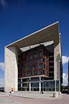
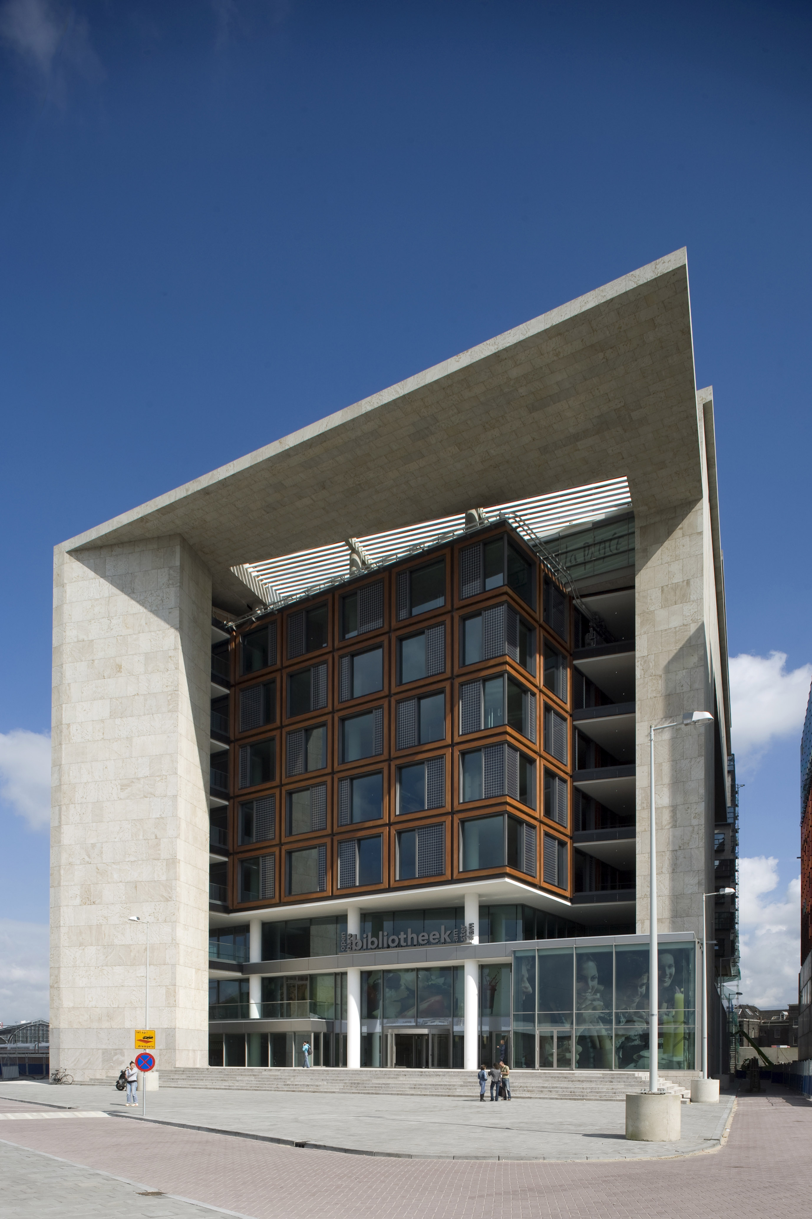
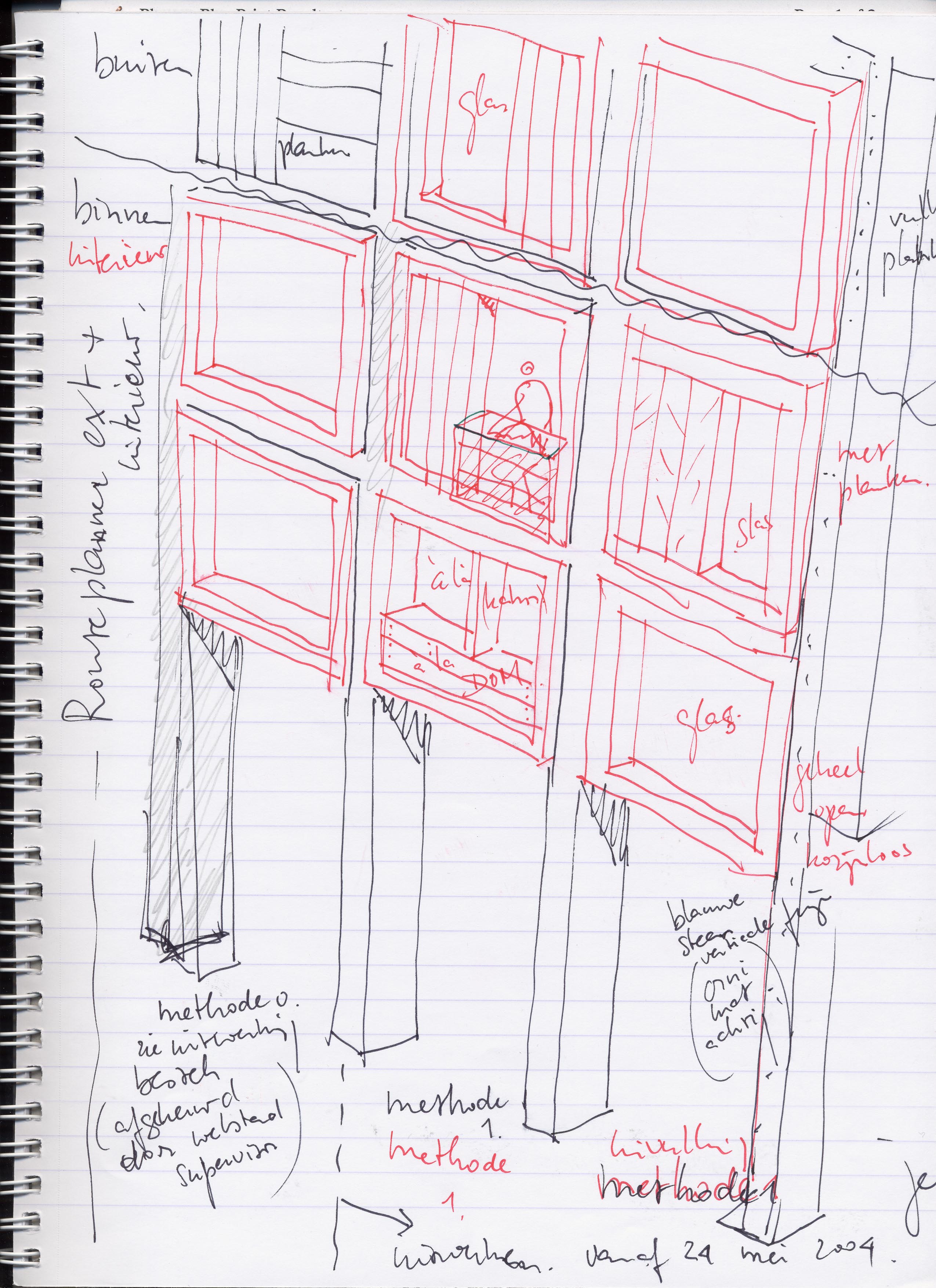
Designing a public library of these dimensions, within the confines of an urban development plan, only became feasible by seeing this commission through the eyes of a sculptor. In order to make life inside as enjoyable as possible, the building was chiselled and ground as if it were a stone monolith. Here and there the building draws back from the alignments prescribed by the urban development plan so that daylight can penetrate the building. In this way, the endless list of requirements to be met did after all permit the construction of a building full of variation, composed of different volumes, enabling an air of intimacy to go together with a clear arrangement of the building.
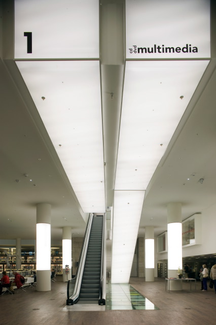
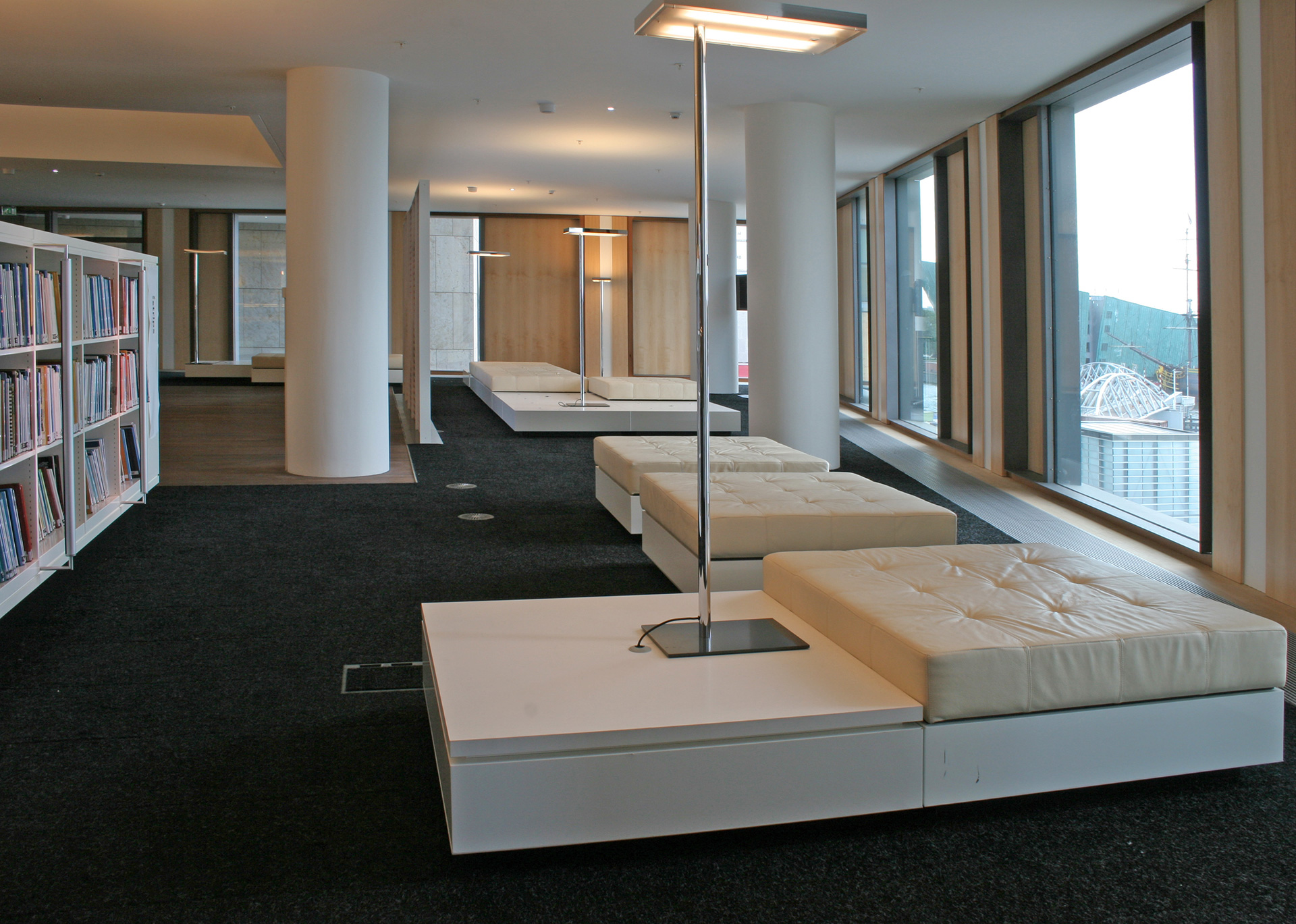
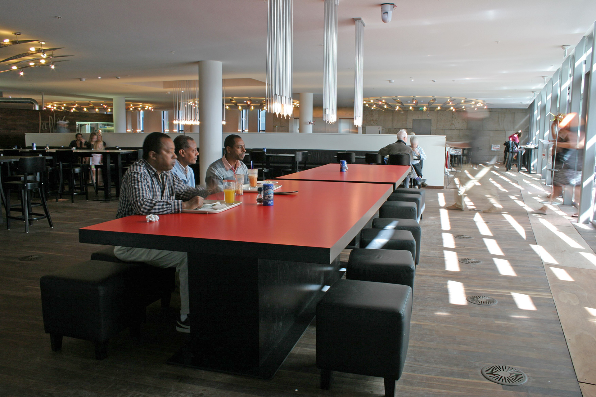
The exterior was created from the inside, so to speak. It's all about 'creating pleasant spots' through the use of light, space and colour. Because of the many different activities offered by the library, it is of crucial importance for these spots to be well tuned to each other. The building must be accessible and open to the core. Because of its many different spots with their very own ambiances, the library remains an attractive place to visit in spite of its large dimensions.
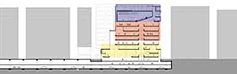
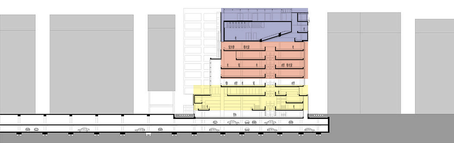
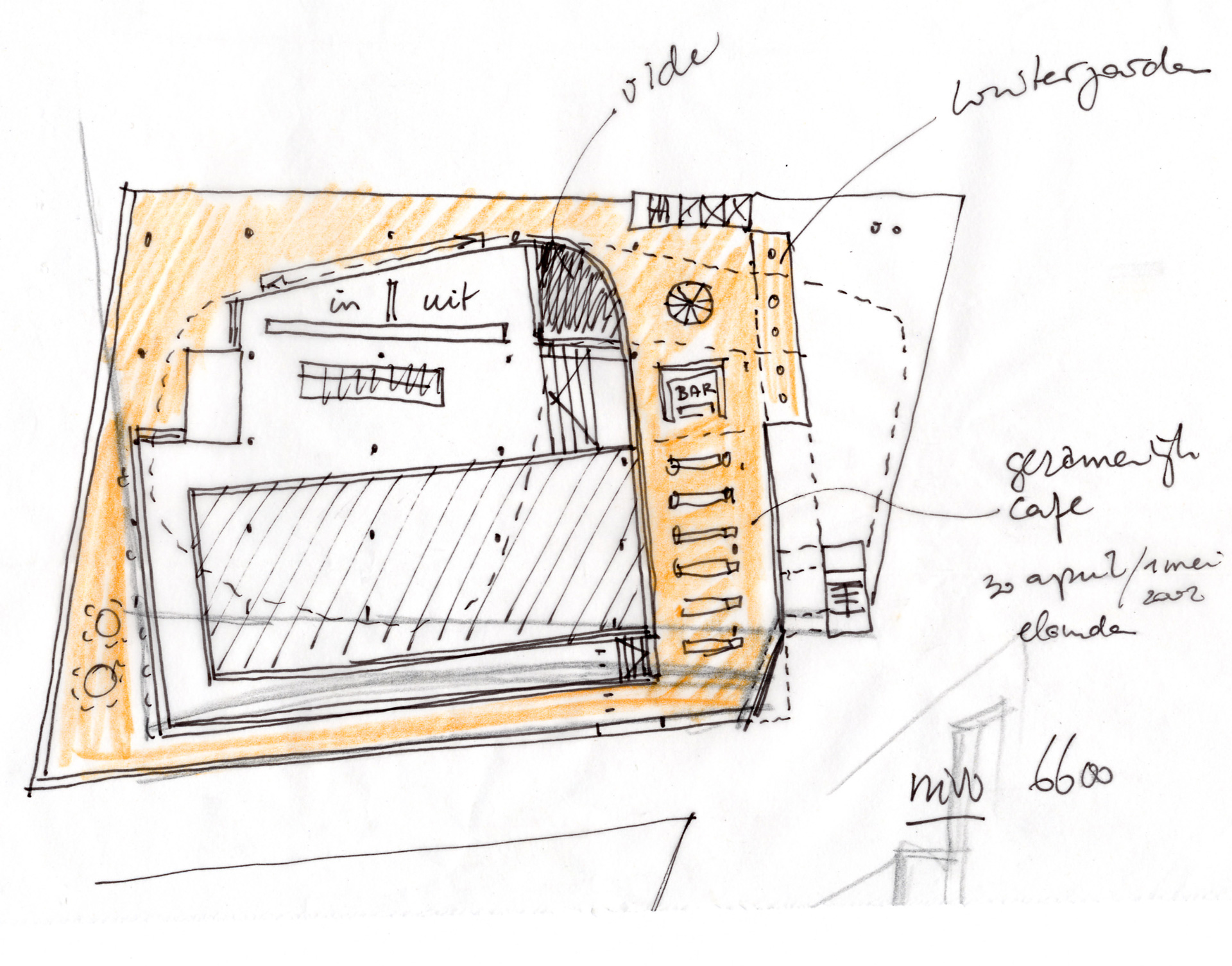
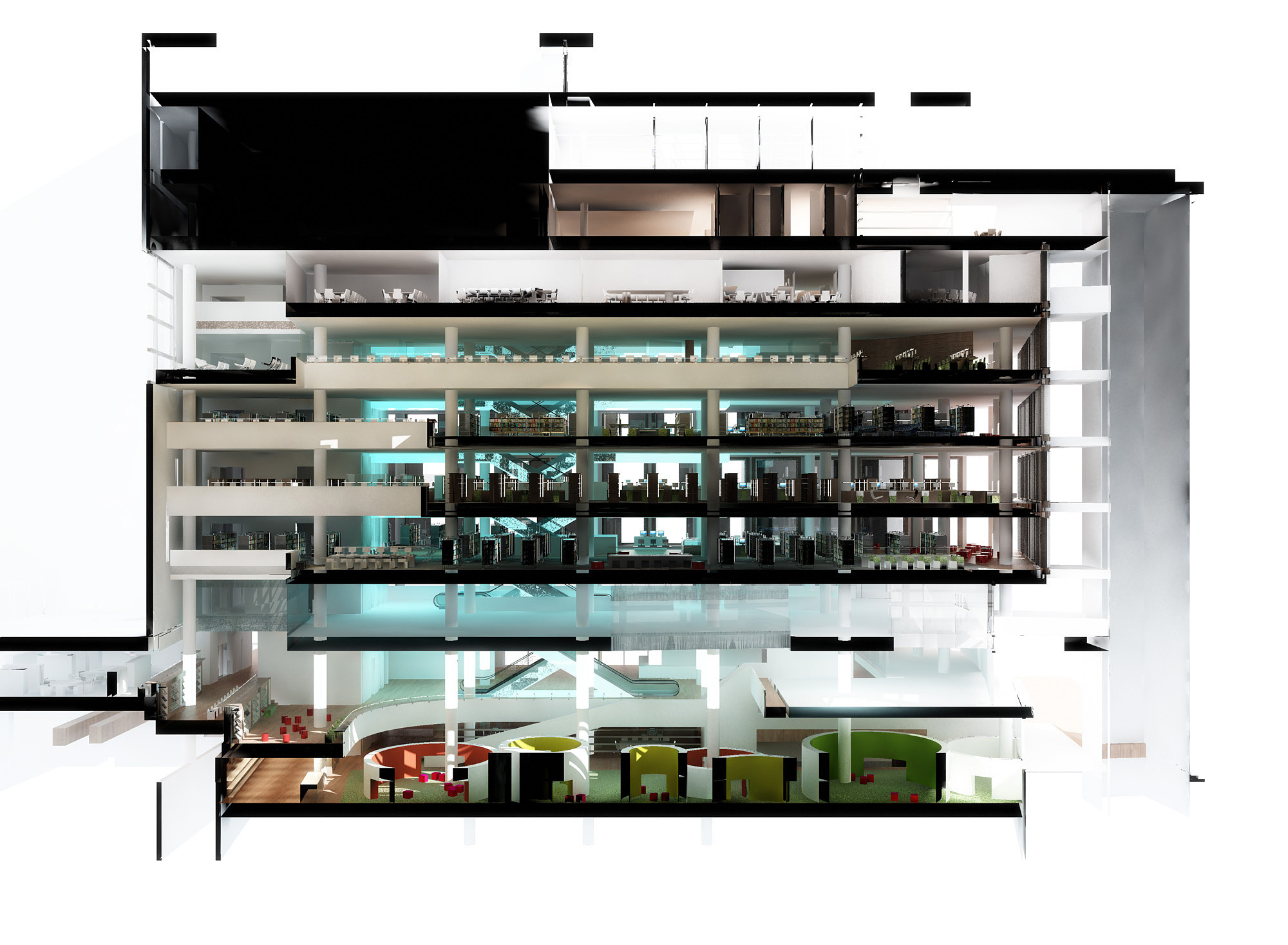
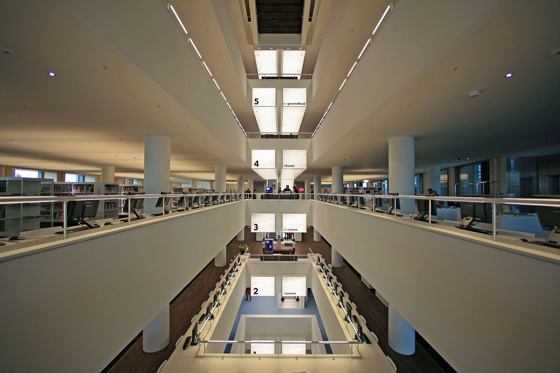
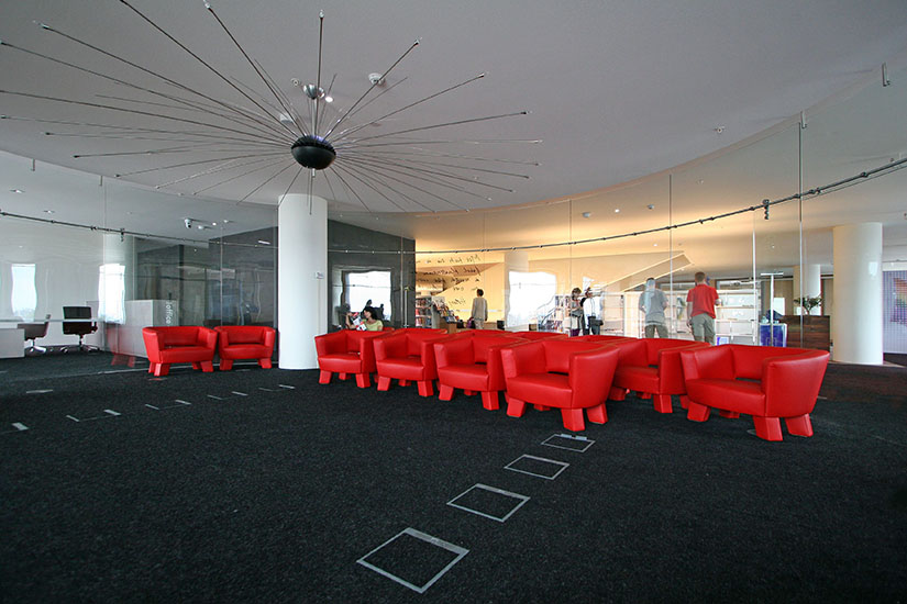
The contrast between the different atmospheres can be traced back to the interior and exterior composition of the building, which consists of a plinth, a centre and a top. The 'plinth' represents fast movement and transience and has a public nature, whereas the 'centre' – which houses the books – symbolizes tranquillity. The 'top', where the theatre and the restaurant are located, is the place where people can relax and meet others. Both the plinth and the top have a public character. The assignment to make the library an exciting, adventurous place to be in, was interpreted as 'giving it character'. The adventurous character of the building was achieved by using art works, interior design elements and lighting as special accents, which made it possible to accommodate the world of culture in an exciting, adventurous public building.
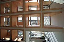
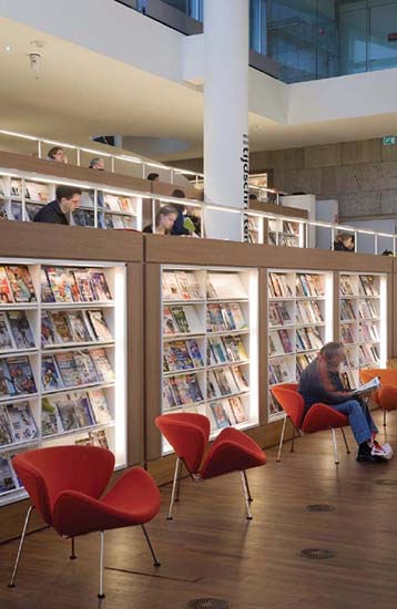
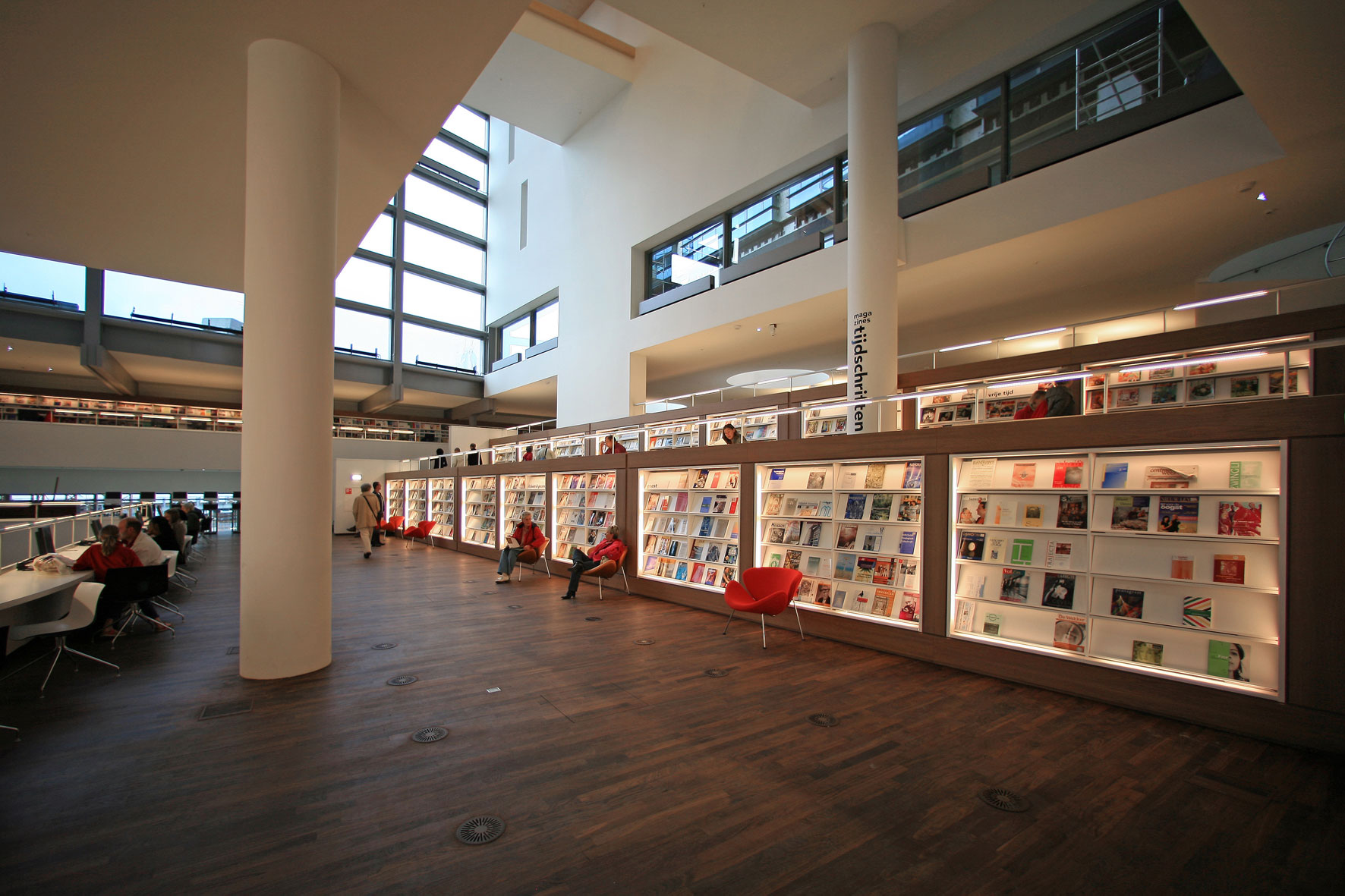
The same materials used for the exterior are used for the interior. The central cores of stability and elevators, as well as the canopy and entrance, were all fi nished with sand-coloured, rough limestone. In this natural stone 'sculpture', slipcases made of Western Red Cedar were placed in a steel framework. This is where the 'centre' of the building is located, housing the actual library with its floors containing the total collection of books. In the western façade, this wall transforms, as it were, into a 'ladder'. To the inside, the wall opens up as slipcases, now finished with American maple. The spaces thus created in the wall have a secluded air and provide a magnificent panorama of the city.